


I’ve been having fun this week using a colour wheel to experiment with colours for some Mandala’s that I’m making.
I thought I’d share my thoughts on how to use a colour wheel in the hope that it will help you do some experimentation too!


As I’m sure you’ll remember from art class at school. There are three primary colours;
Yellow, Red and Blue.

And three secondary colours, which you make by mixing the primary colours (in equal proportions);
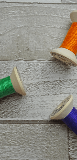
Orange, Purple and Green
The colours in the middle are made by mixing these primary colours with the secondary colours. If you don’t believe me, try with some paint, its actually quite fun!! 🙂 I tried it with my left-over Scheepjes Catona yarn…!!


The logic of colour wheels is quite simple.


Colours which are opposite each other are “Complimentary”.
For example Green and Red or Orange and Blue
Using these colours together will create a high-contrast and make them stand out.


Colours which are adjacent to each other are some times called harmonious colours
For example: Red and Orange or Green and Yellow
These colours will go well together simply because they are next to each other and therefore close in “tone”.


The final set of colours that I’m considering are “Triadic colours” they are spaced equally apart on the colour wheel.
For example,
Blue, Red and Yellow or Orange Purple and Green
Using these colours will create a vibrant mix, like for Complimentary colours
Of course, with yarn, there are so many different shades of yarn, it gets a bit more complicated. To work out whether the colours I’m thinking of will work, I’ve tried to “group” my yarn into the colour groups above, this is useful when thinking about adjacent colours as a light green may well be next to a dark green, but they are both green!
So I found the easiest way is to organise it into colour groups. That made it easier to see which groups were adjacent, complimentary or triadic.


And so the experimenting can begin…..


Of course, you may want to add in more than two or three colours, in which case you can think about the tone that you want to create. For example, for my Mexican Sunshine Mandala, I wanted a vibrant feel, so I used Green, Purple and Orange (Triadic) and added in some red which was complementary to the Green.


Using the same logic, I could use blue, red and yellow (Triadic tones) with a purple to compliment the yellow…


My other tip for creating mandala’s specifically is you want a mix of light and dark shades of the colour, use just dark colours and it looks good but it doesn’t have the same “pop”….in my opinion!
Go on and give it a go! I’d love to see the colour combinations that you come up with! Feel free to post them in the comments if you want! 🙂
Jo Out…
x
